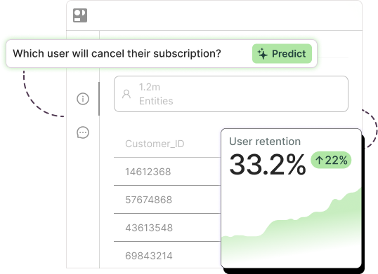
Business intelligence analyzes historical data to show what happened and why: dashboards, KPIs, cohort reports, drill-downs. Predictive analytics uses the same historical data to score what is likely to happen next for each customer, product, or account, before the outcome is final.
Both run on the same tables. The difference is the direction of the timestamp. A dashboard aggregates rows that have already closed. A model scores rows that haven’t closed yet. That’s the whole distinction, and it’s why the question “BI or predictive?” is the wrong one. Every company we’ve worked with that got value from prediction kept its BI stack exactly where it was and added a layer on top.
The side-by-side first, then the honest answer for when each one is enough.
Business intelligence vs. predictive analytics: the comparison
| Business intelligence | Predictive analytics | |
| Question answered | What happened, and why? | What will happen, for whom, and when? |
| Output | Aggregates, trends, KPIs, drill-down reports | A score, probability, or forecast per entity (customer, SKU, lead) |
| Data direction | Backward: summarizes closed periods | Forward: uses history up to a marker date to estimate an open outcome |
| Techniques | SQL aggregation, OLAP, visualization, cohort analysis | Classification, regression, time series, ensemble machine learning |
| Typical tools | Power BI, Tableau, Looker, Qlik, Metabase | Predictive AI platforms (Pecan), AutoML, Python/R stacks, cloud ML services |
| Users | Analysts, managers, executives reading reports | Analysts and business owners acting on ranked lists |
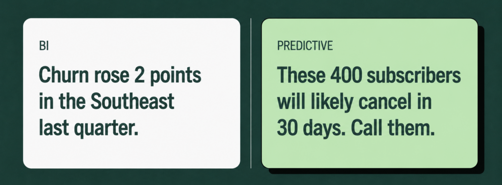
| Example decision | “Churn rose 2 points in the Southeast last quarter, let’s investigate” | “These 400 subscribers have the highest 30-day churn probability, call them this week” |
Read the last row twice. The BI version is a diagnosis. The predictive version is a work order.
What is business intelligence?
Business intelligence is the practice of collecting, modeling, and visualizing historical data so people can understand performance. The stack usually looks like a warehouse (Snowflake, BigQuery, Redshift, Databricks), a semantic layer or data model, and a visualization tool on top. The output is a report or dashboard that someone reads.
BI is where most data-mature companies already live, and for good reason. It answers the questions a board asks: revenue by segment, margin by product line, pipeline by stage, churn by cohort. In sales, that’s win rate and cycle length by rep. In finance, it’s actuals versus budget. In supply chain, it’s inventory turns and fill rate by SKU.
The limit of BI is structural, not a flaw. A dashboard can tell you the churn rate went up. It cannot tell you which specific customers are about to leave next month, because that information doesn’t exist in any closed period yet. You’d have to infer it from patterns, and inferring from patterns at scale is what a model does. Our analytics vs advanced analytics guide draws this line in more detail.
What is predictive analytics?
Predictive analytics assigns a probability or numeric forecast to a future event for each entity you care about, using patterns learned from history. If you want the full definition, five-step process, and technique breakdown, start with our guide to what predictive analytics is. The short version for a BI owner:
The input is the same warehouse data your dashboards already read. The unit of output changes from an aggregate to a row-level score. And the timestamp flips: instead of summarizing what closed, the model looks at each entity’s history up to a point in time and estimates what happens in the window after it.
For a sales team, that means “which open leads will reach a second call this quarter.” For finance, “which accounts are likely to pay late.” For supply chain, “how many units of SKU 4471 will we need in week 38.” Each one is a forecast someone can act on before the period closes.

When BI is enough, and when you need predictions
Five situations we hear every week, with the honest answer for each.
“We need to explain last quarter to the board.” BI. This is what dashboards are for. A model won’t help you explain a closed period, and building one for this purpose is a waste of a good model.
“We need to know which customers will leave next quarter.” Predictive. No amount of drill-down produces a ranked list of at-risk accounts, because the rows haven’t closed. This is the single most common first predictive question we see, and it’s where a BI team usually discovers the boundary of its stack.
“We want to see churn by cohort and region so we can spot problems.” BI, with a caveat. Cohort views are excellent for spotting where the problem is. They won’t tell you who the problem is. If your next sentence is “and then we’ll call them,” you need a model on top.
“We want to know how much inventory to order for Q4.” Both. BI gives you last year’s Q4 by SKU, which is your baseline. A time series model adds trend, seasonality, promotions, and external drivers, and forecasts week by week with confidence intervals. Planners using Pecan’s forecasts have averaged roughly 60% less time building and adjusting forecasts, mostly because the model handles the baseline and they handle the exceptions.
“Sales wants to know which leads to call first this morning.” Predictive. A lead score that refreshes daily inside the CRM is a prediction. A “leads by source” chart is a report. Reps act on the first and ignore the second.
The pattern: if the sentence ends with a closed period, BI. If it ends with a future window and a person who has to act, you need a prediction.
From BI to predictive: the maturity path
If you run a BI function, here’s the uncomfortable-but-good news: you’re most of the way there. A large share of the customers who come to Pecan arrive with a mature BI stack already in place: a warehouse, a governed data model, agreed KPIs, and dashboards people actually read. That is the hard part, and you’ve done it.
What follows: what a BI team already has, what’s missing, and the first predictive use case to bolt onto an existing dashboard.
What you already have
A warehouse with historical, event-level data. Defined metrics, which means you’ve already agreed on what “churn” or “conversion” means. Clean joins between customers, transactions, and products. And an audience that trusts your numbers. Every one of those is a prerequisite for a model, and none of them need to be rebuilt.
What’s missing
Three things, and they’re smaller than they sound.
A target definition. Your churn KPI says what churn is. A model needs it as a per-customer label with a marker date: “for each subscriber active on day X, did they cancel in the 30 days after?” That’s a SQL query, not a research project.
A validated model. Something has to learn the patterns and prove, on held-out data, that it can rank tomorrow’s churners above tomorrow’s stayers. This is the step that used to require a data science team. It’s now the step a platform handles, including the validation and the health checks that catch leakage and overfitting.
A write-back. The scores have to go somewhere a person acts: a CRM field, a warehouse table your dashboard reads, a daily list in the marketing tool. Your existing BI can show the scores, which is a nice bonus. But the action happens in the operational system, not the report.
The first use case
Pick the KPI on your dashboard that people complain about most, and predict it at the entity level. For most subscription and retail businesses, that’s churn.
Whistle Express, an express car wash operator running on monthly wash plans, is a clean example. They could already see churn in their reporting, and they knew it ran higher in newly acquired, competitive markets. What the reports couldn’t do was say which members would cancel next. Their data team was three people. Working with Pecan, they framed the question as “two weeks after a member recharge, will they fail to renew in the next month,” had initial models in two to three weeks, and reached production in under two months. The predictions now flow into marketing workflows to trigger loyalty offers and SMS outreach, and steer regional ad spend toward geographies where churn risk is rising. The result was a 30% churn reduction in key markets. Manas Desai, their data engineer, put the before-and-after plainly: building a machine learning model used to mean eight to twelve months. Read the Whistle Express story.
Notice what didn’t change. Their dashboards stayed. Their KPIs stayed. Their warehouse stayed. The only thing added was a scoring layer and a place for the scores to land. That’s the maturity path in one sentence, and it’s the core of any serious data-driven strategy: keep the reporting, add the prediction, connect it to an action.

Can Power BI or Tableau do predictive analytics?
Some, and it’s worth being precise about how much, because “our BI tool has AI” is how a lot of predictive projects stall.
Both Power BI and Tableau ship built-in forecasting for time series charts. In Power BI it’s the Forecast option in the Analytics pane on a line chart; in Tableau it’s the Forecast feature under Analytics. Under the hood, both use exponential smoothing: they extend a trend line forward with a confidence band, detecting seasonality automatically. That’s useful for a quick revenue projection or a call-volume trend line. Power BI also offers AI visuals like Key Influencers and Decomposition Tree, which explain what drove a metric, and AutoML inside Dataflows for teams on the right licensing tier. Tableau offers trend lines and integration with Salesforce’s Einstein models.
What these don’t do is the entity-level scoring that makes prediction operational. A forecast line on a churn chart tells you next quarter’s rate. It does not tell you which 400 customers to call, why each one scored high, or whether the model has leaked future information into its training data. Building that requires a modeling layer: something that reshapes event-level history into per-entity training sets, engineers features, validates on out-of-time data, and writes scores back to the systems where people work.
The practical setup we see most often is BI and a predictive platform side by side. The model writes churn probabilities into a warehouse table; Power BI or Tableau reads that table and shows the distribution, the trend, and the drivers, right next to the historical KPIs. Same dashboard, one new column. If you’re evaluating what to put beside your BI tool, our guide to the best AI platforms compares the categories, including where BI-native features end.
Is predictive analytics part of business intelligence?
What is the difference between BI and AI?
Can Power BI do predictive analytics?
Do I need predictive analytics if I already have dashboards?