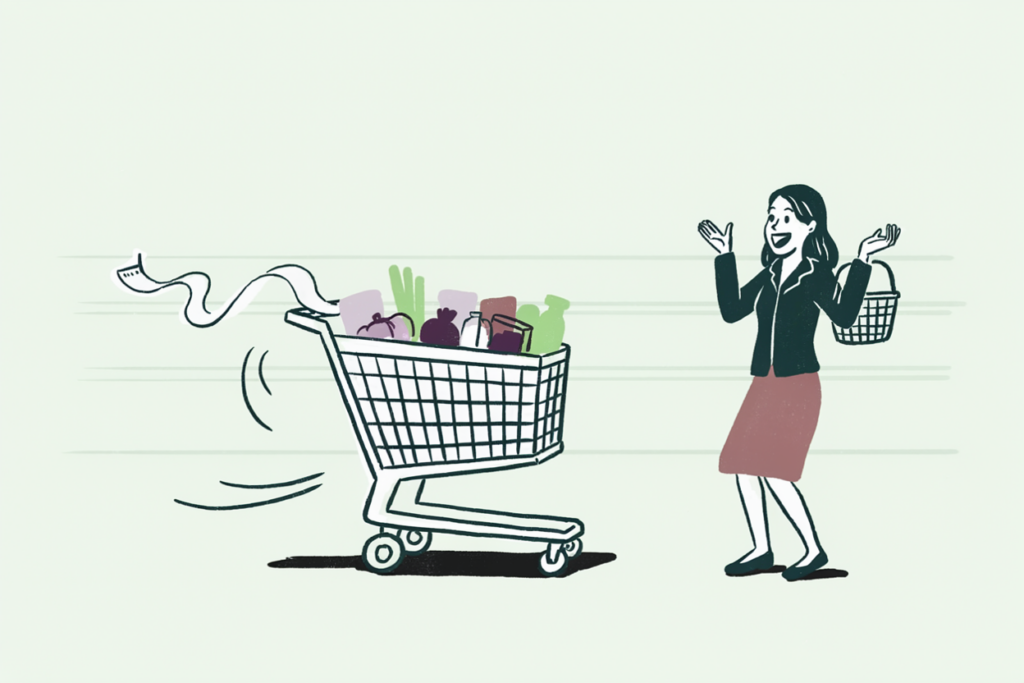
Most campaign budgets go to people who had already decided. The 20% off email lands in the inbox of a customer who was going to reorder that afternoon anyway, and the campaign report counts her as a win. Meanwhile the one customer who was sitting on the fence, the person that email was built for, gets the same treatment as everyone else, and afterward nobody can tell the two apart.
Uplift modeling exists to tell them apart. Uplift modeling (also written uplift modelling) predicts the causal effect of an action on each individual customer: how much more likely someone is to buy, renew, or come back because you sent the offer, compared with what they would have done on their own. You then target only the customers the action changes.
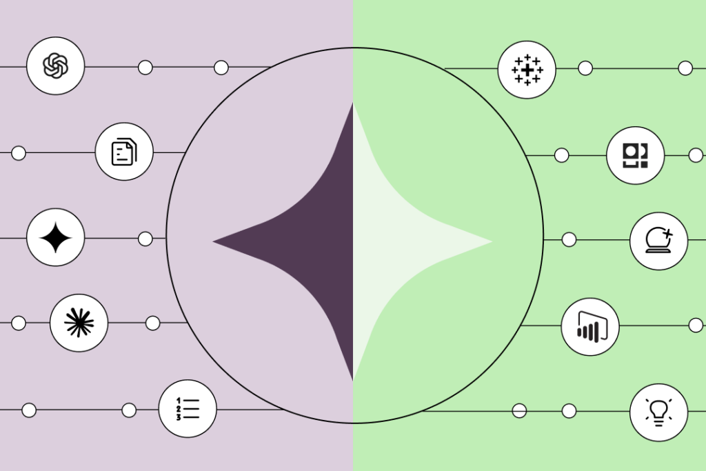
That last clause is where the money is. A propensity model ranks your list by who is most likely to buy. An uplift model ranks it by who is most likely to buy because of you. The two lists overlap far less than most marketers expect, and the gap between them is where the two most wasted lines in a marketing budget live: discounts handed to people who were already buying, and messages sent to people who were better off left alone.

What is uplift modeling?
Every campaign has two possible outcomes for every customer: what happens if you act, and what happens if you don’t. You only ever get to observe one of them. Uplift modeling estimates the other one.
Direct marketers came up with the idea in the late 1990s, when catalog and telecom marketers noticed their response models kept recommending customers who would have responded anyway. The academic literature calls the same concept “true lift,” “incremental modeling,” or “net lift,” and causal-inference researchers call the quantity it estimates the conditional average treatment effect. Different names, one job: measure the difference an action makes, per person, and act only where that difference is positive and large enough to pay for the action. (Wikipedia’s uplift modelling entry is a decent map of the terminology if you want it.)
In practice the “action” is anything you can choose to do or not do for a customer. A discount. A retention call. A free month. A push notification. A sales rep’s afternoon. The “outcome” is whatever you care about: purchase, renewal, reactivation, upgrade. Uplift is the change in the outcome caused by the action.
What the method needs in order to work is a comparison. Somewhere in your history there has to be a group that received the action and a similar group that didn’t. We’ll come back to that, because it’s the single most common reason uplift projects stall before they start.
Uplift vs. propensity: who will buy vs. who will buy because of you
Smart teams trip over this distinction constantly, so it gets a table.
| Propensity model | Uplift model | |
| Question it answers | How likely is this customer to convert? | How much does my action change this customer’s likelihood to convert? |
| Output | One probability per customer | One uplift score per customer, which can be negative |
| Training data | Outcomes for customers you have history on | Outcomes for a treated group and a comparable untreated group |
| Who lands at the top of the list | Your most loyal, most engaged customers | Customers on the fence |
| Best use | Prioritizing effort where an outcome is likely: lead scoring, LTV, churn risk | Deciding who should receive an intervention that costs money or can backfire |
| Failure mode | Spends budget on customers who would have converted anyway | Needs a control group, and harder to explain to stakeholders |
Propensity models are excellent tools. Most predictive lead scoring is exactly this: rank the pipeline by likelihood to close so reps spend their hours well. A rep’s time is a scarce resource with no downside for the customer, so “most likely to buy” is the right ranking. Discounts are a different animal. A discount given to someone who was already buying has a hard cost and zero benefit. A retention call to someone who had forgotten they were still paying you has a cost and a negative benefit.
So the rule of thumb: when the action is cheap and harmless, propensity is fine and simpler. When the action costs margin or can push a customer away, you need uplift.
One more practical difference. A propensity model’s top decile is full of your best customers. Target that decile and your before-and-after numbers will look wonderful while your incremental revenue sits close to zero. Hydrant, a drink-mix brand, ran into this pattern when it modeled repurchase with Pecan: the team stopped sending discounts to customers who would have come back without one and moved that budget toward the customers an offer actually moved. In the win-back A/B tests that followed, the group Pecan flagged as least likely to return on their own converted at 2.6x the control rate when sent a targeted offer, with 3.1x the revenue per customer. The full Hydrant story has the details.
The four customer quadrants (persuadables, sure things, lost causes, sleeping dogs)
Cross the two things you can never see at the same time (would they convert if treated? would they convert if left alone?) and every customer lands in one of four boxes.

Persuadables. They convert if you act and don’t if you don’t. This is the only quadrant where your campaign earns its budget. Every dollar spent outside it is either wasted or harmful. In most campaign models persuadables are a minority of the list, which is exactly why blanket sends look so inefficient in hindsight.
Sure things. They convert whether you act or not. Targeting them feels great on the dashboard, because their response rate is the highest of any group. It also burns margin on every single one. A 20% discount to a sure thing is a 20% price cut you chose to take for nothing. The deployment data makes the cost visible from the other side: one retention program cut churn 30% by treating only 2% of the customer base, and two other deployments used predictions specifically to stop sending discounts to customers who didn’t need them. If you’ve ever wondered why a promotion “worked” and the quarter’s margin still came in light, this quadrant is usually the answer.
Lost causes. They don’t convert either way. Contacting them costs a send and a little goodwill, and produces nothing. Dead weight, and most lists carry a lot of it.
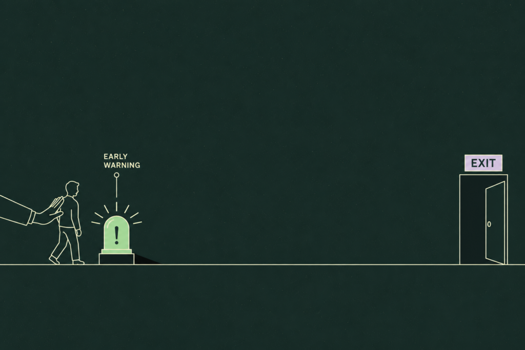
Sleeping dogs. They would have converted (or stayed) if left alone, and your contact nudges them the other way. The retention email that reminds a lapsed subscriber to cancel. The “we miss you” message that lands as pestering. The renewal call that prompts a customer to shop around. This quadrant is small in most datasets, and it’s the only one with a negative return. Standard campaign reporting cannot see it at all, because people who churned after you contacted them look exactly like people who churned. Win-back campaigns are where sleeping dogs bite hardest, because the whole audience is already halfway out the door.
Strategically, then: a propensity model puts sure things at the top of your list and can’t tell a sleeping dog from a persuadable. An uplift model separates all four. That separation is the entire value.
A worked uplift example: the discount campaign
Numbers make this concrete. Suppose you have 10,000 lapsed customers and a $10 discount code. You run a randomized test first: 5,000 get the code, 5,000 don’t. With the results in hand, the population turns out to break down like this (rounded for readability):
| Quadrant | Share of list | Conversion if sent the code | Conversion if not sent | Uplift per customer |
| Persuadables | 15% (1,500) | 40% | 5% | +35 points |
| Sure things | 25% (2,500) | 90% | 90% | 0 |
| Lost causes | 50% (5,000) | 2% | 2% | 0 |
| Sleeping dogs | 10% (1,000) | 20% | 30% | −10 points |
Now compare three ways of targeting the full 10,000. Count only incremental conversions (the ones that happen because of the code) and count $10 of cost for every code redeemed.
| Strategy | Codes redeemed | Incremental conversions | Discount cost | Cost per incremental conversion |
| Send to everyone | 3,150 | 425 | $31,500 | $74 |
| Send to the top 40% by propensity | 2,850 | 525 | $28,500 | $54 |
| Send to persuadables only (uplift) | 600 | 525 | $6,000 | $11 |
Read the middle row carefully, because it’s the one that fools people. The propensity model’s top 40% is the sure things plus the persuadables. It produces the same 525 incremental conversions as the uplift strategy and pays almost five times as much for them, because 2,250 of those redeemed codes went to customers who were buying anyway. The blanket send does worse than either: it picks up the 100 conversions lost among sleeping dogs, which drags net incremental down to 425 while spending the most of the three.
Same campaign. Same creative. Same discount. The only variable is who you send it to, and that is the whole pitch for uplift modeling in one table.

How uplift models are built (treatment and control, in plain English)
There’s no way around this part. To model the effect of an action, your data has to contain the action being taken and not taken on comparable people. That means a holdout.
The randomized holdout. Before the campaign, split the audience at random. Most get the treatment: the offer, the call, the email. A slice, often 10 to 20 percent, gets nothing. Because the split was random, the two groups are alike in every way except the treatment, so any difference in outcomes is the treatment’s effect. This is also what makes the model trustworthy later. If your holdout was “whoever we didn’t get around to calling,” the groups differ in ways that have nothing to do with the call, and the model learns those differences instead. Clearwave Fiber, a fiber internet provider, runs its retention program this way, comparing treated subscribers against control groups to measure true lift rather than raw churn. In the highest-risk segment, treated customers churned at 1.2 to 1.5 percent against roughly 40 percent for the untreated group. Without the control group, that 40 percent would have been invisible.
The two-model approach. The simplest way to estimate uplift is to train one model on the treated group (predict conversion given the offer) and a second on the control group (predict conversion without it), then score every customer with both and subtract. Easy to explain, easy to build with any classifier, and it has a known weakness: each model is tuned to predict its own outcome rather than the difference between the two, so small errors in each can swamp the uplift signal when the true effect is subtle.
The single-model approach. Train one model on everyone with a flag for “was treated” as an input, and let it learn how that flag interacts with everything else. Score each customer twice, once with the flag on and once off, and take the difference. Variants of this idea, including uplift-specific tree algorithms that split on wherever the treatment effect differs most, are what the specialist libraries such as Uber’s CausalML and scikit-uplift implement. They tend to beat the two-model approach when uplift is small, at the cost of being harder to build and explain by hand.
Which approach is “right” matters less than the holdout. A plain uplift model on clean randomized data beats a sophisticated one on a self-selected sample every time.
How to measure uplift (and where incrementality testing fits)
You can’t grade an uplift model on accuracy, because the true uplift for any single customer is unobservable. So the standard check is to score a fresh audience, rank it by predicted uplift, cut it into deciles, and inside each decile compare conversion between customers who were treated and customers who were held out.
A good model shows a steep slope. The top decile has a large positive gap between treated and control, the middle deciles shrink toward zero, and the bottom decile may go negative (those are your sleeping dogs, surfaced). A weak model shows a flat line, meaning it ranks people no better than chance would. The cumulative version of this chart is the Qini curve, uplift’s answer to the ROC curve, and the area under it is the number data scientists quote to each other.
For a marketer, the decile table is more useful than the curve because it tells you where to draw the line. If deciles one through three show uplift that covers the cost of the offer and decile four doesn’t, you send to 30 percent of the list and stop.

Incrementality testing: the campaign-level cousin
Incrementality answers a coarser version of the same question: did this campaign, channel, or budget line produce results that wouldn’t have happened without it? The method is the same holdout logic applied to a whole audience or region rather than a person. Geo holdouts, ghost ads, and matched-market tests are all incrementality testing.
Put the two side by side and the relationship is simple. Incrementality testing tells you whether the campaign was worth running. Uplift modeling tells you who it was worth running on. Teams that already run incrementality tests have the raw material for uplift models sitting in their results, because a holdout is a holdout. Teams that have never held anyone out have neither, and that’s usually the place to start.
How to run uplift-style targeting without a data science team
Here’s what you actually need, and it’s less than the literature makes it sound.
Data you already have. One past campaign where some customers were contacted and a comparable group wasn’t, with the outcome recorded for both. Customer-level history from your CRM, warehouse, or ecommerce platform: purchases, engagement, support tickets, whatever describes the customer before the campaign ran. It does not need to be tidy. Real campaign data is messy, has gaps, and lives in three systems, and that’s normal and workable. The one thing you can’t fake is the holdout. If you don’t have one, run your next campaign with a random 10 to 20 percent held out and you’ll have it within a cycle.
A question phrased causally. “Which customers are most likely to reorder?” is a propensity question. “Which customers are more likely to reorder if we send the 15% code than if we don’t?” is an uplift question. Getting the question right does more for the result than any algorithm choice.
A way to act on the score. An uplift score that lives in a notebook changes nothing. It needs to land in the tool that sends the campaign, whether that’s your ESP, your ad platform, your CRM, or the customer segmentation workflow that already feeds them.
That path is what Pecan’s Predictive AI Agent is built for. You ask the question in plain language, point it at your campaign history, and it handles the parts that usually need a data scientist: joining the data, building the features, choosing and validating the model, and catching leakage and imbalance before they poison the result. Predictions land where the campaign runs, each with an explanation and a confidence score attached, and the model is monitored so you know when it’s time to retrain.
SciPlay, a mobile games publisher, went through a version of this on retargeting. Business rules were serving ads to players who would have come back on their own. Models built by the marketing team in Pecan identified the players who actually needed the nudge, and the company reports saving millions annually on retargeting spend as a result. Whatever your action costs, the question is the one SciPlay asked: who does this change?

If you have a campaign with a holdout, we can model who your offers actually move on your own data. Book a demo and bring the campaign.
What is the difference between uplift modeling and propensity modeling?
What are persuadables in marketing?
What data do you need for uplift modeling?
Is uplift modeling the same as A/B testing?

Omer is a Data Scientist at Pecan AI with an M.Sc. in Industrial Engineering, bringing a strong analytical foundation built across multiple industries. He combines structured problem-solving with cross-disciplinary collaboration to drive meaningful impact through data.