Every subscription business loses customers. The figure that lands on the board deck, last quarter’s churn rate, is real enough, but it describes a decision your customers finished making weeks or months ago. By the time that number moves, the people behind it have usually left.
The more useful question sits underneath it. Of the customers active in your base right now, which ones are heading for the exit, and will your team notice while there’s still time to do something?
Most churn guides answer neither. They hand you a formula, a couple of dashboards, and a tidy profile of a churned customer. Then teams take that profile and go hunting for live customers who match it. The resulting watchlist is wrong far more often than anyone expects, and I’ll explain exactly why. This guide covers the analysis worth doing (the formula, the segmentation, the metrics that matter), and then the part most articles skip: where backward-looking churn analysis quietly fails as an early-warning system, and how predictive churn modeling picks up where it stops.

What is churn rate?
Churn rate is the percentage of customers, or revenue, you lose over a set period. The basic formula is simple:
Churn rate = (customers lost during the period / customers at the start of the period) × 100
If you began the month with 1,000 customers and 40 cancelled, your monthly churn rate is 4%.
Two distinctions matter before you read too much into that figure.
Monthly versus annual. A 4% monthly churn rate doesn’t add up to 48% a year, because each month compounds on a shrinking base. Track both, and always say which one you’re quoting. The gap between the two is where a lot of reporting confusion lives.
Gross versus net. Gross churn counts what you lost. Net churn factors in expansion revenue from the customers who stayed and grew. A business can post negative net churn (a genuinely strong sign) while still bleeding logos underneath, which is why reading one without the other hides problems.
If you want the deeper background on why recurring-revenue models live and die on this metric, our breakdown of subscriber churn goes further than I will here.
How to do churn rate analysis
Calculating the rate takes a minute. Analyzing it, finding where churn concentrates and what tends to precede it, is the real work. Here’s a five-step framework that holds up across most B2B and B2C subscription models.
- Define your churn event. Decide what actually counts as churn. A hard cancellation is obvious. Non-renewal, a downgrade, or ninety days of zero logins might matter just as much, and for usage-based products, silent inactivity often shows up long before the contract ends.
- Segment your customers. A single blended rate hides almost everything useful. Break it down by plan tier, acquisition channel, tenure, company size, and usage level. Churn is rarely spread evenly.
- Calculate churn per segment. Now compare. You’ll usually find churn pooling in a few specific places: a particular plan, customers from one channel, accounts in their second or third month. That concentration is your map.
- Identify churn signals. Look at what churned customers had in common before they left: a drop in usage, a spike in support tickets, a failed payment, a champion who stopped logging in. Write these down, and hold onto a little skepticism while you do, for reasons I’ll get to.
- Map churn timing. Plot when churn spikes across the lifecycle. Right after the trial? At the first renewal? Month two, once onboarding momentum fades? Timing tells you where to aim retention effort.
Do this well and you’ll understand your churn better than most of your competitors understand theirs. You’ll also run straight into the ceiling of what analysis alone can tell you, which is the interesting part.
Churn metrics worth tracking
A handful of metrics, read together, give you a fuller picture than any single rate.
- Monthly and annual churn rate. Your baseline pulse, useful for trends as long as you keep the time window consistent.
- Revenue churn versus logo churn. Losing ten small accounts and losing your single biggest customer can produce identical logo churn and wildly different revenue churn. Watch both.
- Cohort churn. Group customers by the month they signed up and track each cohort over time. This is how you tell whether a product or onboarding change actually moved retention, instead of guessing.
- Net revenue retention (NRR). Expansion minus churn and contraction across your existing customers. Investors care about it, and so should you.
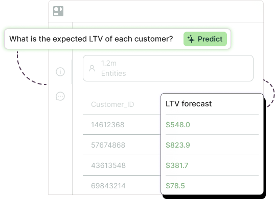
- LTV impact. Every point of churn shortens average customer lifetime and drags down lifetime value. Tie churn back to LTV and the cost of the problem stops feeling abstract.
Each one answers a different question. Cohort churn tells you whether you’re improving. Revenue churn tells you how much the losses hurt. NRR tells you whether growth from existing customers is outrunning the bleed.
Where churn rate analysis hits a ceiling
This is the failure mode I flagged earlier, and it’s worth slowing down for.
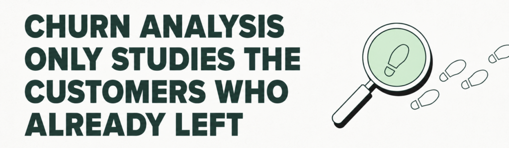
Churn analysis is built entirely on customers who already left. You study the leavers, pull out their shared traits, and treat those traits as a warning label for the next ones. The trouble is that the same traits live all over your retained base too. Plenty of loyal, long-term customers have a slow usage month, file the occasional support ticket, and miss a payment now and then.
So when you turn “low usage plus a support ticket” into a churn-risk rule and run it against your whole account list, you don’t get a short, sharp list of people about to leave. You get a long one, most of whom were never going anywhere.
I’ve watched this play out. A CS team builds the rule, exports the flagged accounts, and starts working the phones. Call after call lands on a customer who’s perfectly content and a little confused about why anyone’s checking in. Within a few weeks the reps quietly stop trusting the list. And the accounts that genuinely were at risk, the quiet enterprise renewal with no support history and steady-looking logins, never got flagged at all, because they didn’t match the stereotype.
That’s the churn profile trap. A retrospective profile can tell you what churners tended to look like. It can’t tell you, for any specific living customer, how those signals stack up against each other or against the base rate of churn in that segment. Doing that by hand, across dozens of signals and thousands of accounts, refreshed every week, is a math problem, and a sizable one.
There’s a second, quieter issue. A single churn rate blends very different kinds of leaving into one figure: the customer who outgrew you, the one who never really onboarded, the one whose card simply expired. Averaged together, the number describes no real customer and points to no single fix.

None of this makes the analysis a waste. It earns its keep by showing you where to look and by surfacing the very signals a model needs. It just runs out of road as an early-warning system. If your team is ready to move from spotting churn after the fact to flagging it ahead of time, our guides on how to predict customer churn and build a working churn prevention motion are good next stops.
From analysis to prediction: how churn modeling works
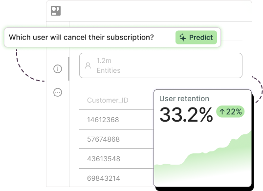
Prediction starts from the same raw material as your analysis: the usage patterns, support interactions, payment history, and engagement signals you already collect. The difference is in the question. Analysis asks what churned customers had in common. A churn prediction model asks something sharper: given everything we know about this specific active customer, what’s the probability they churn in the next period?
To answer that, the model learns from both groups at once, the customers who left and the ones who stayed. That comparison is the piece manual analysis can’t replicate. By weighing every signal against every other signal, and against how common each one is among customers who never leave, the model produces a calibrated risk score for each customer instead of a one-size-fits-all profile. The output is a ranked, living list: who’s most likely to churn next month, updated as behavior changes.
Building that by hand has traditionally meant a data science team, weeks of feature engineering, and careful work to dodge traps like data leakage and overfitting. That barrier kept churn prediction models out of reach for teams without ML headcount. If the underlying concept is new to you, our primer on what is predictive analytics is a gentle place to start.

This is where Pecan fits. Pecan’s Predictive AI Agent runs the full workflow for you. Connect your data, ask your churn question in plain English, and the agent prepares the data, engineers the features, builds and validates the model, and pushes the scored predictions straight into Salesforce, HubSpot, or your data warehouse, wherever your team already works. No code. No consultants. No waiting weeks for a model. Built-in guardrails handle the data-leakage and overfitting issues that quietly wreck homegrown models. Teams using this approach report around a 12% reduction in churn, because the at-risk list is finally accurate enough to act on.
If you’d rather compare your options first, our rundown of churn prediction software and our guide to putting churn predictive analytics to work both go deeper. And when you’re ready for the rollout itself, here’s how to implement predictive churn modeling end to end.
Start with analysis, win with prediction
The teams pulling ahead on retention treat the analysis as step one and the prediction as the payoff. They map where churn concentrates, learn what tends to precede it, then hand those signals to a model that scores every living customer and flags the ones worth a call this week.
Start with the framework above. Get your churn event, your segments, and your timing clear, because a model is only ever as good as the signals you feed it. Once the analysis has shown you where the problem lives, the next move is to stop reading reports about customers you’ve already lost and start working a ranked list of the ones you can still keep.
That shift, from measuring churn to predicting it, separates a retention team that reacts from one that gets there first.

Ready to act before customers leave? See how Pecan predicts churn straight from your data: Book a demo.

Asaf is the Head of Customer Success at Pecan AI, where he helps enterprise customers turn predictive analytics into real, measurable business outcomes. He’s grown through Pecan from AI Success Manager to Team Lead to Director, bringing a strategic consulting background and an Economics degree from the Hebrew University of Jerusalem (plus a serious scuba diving habit).