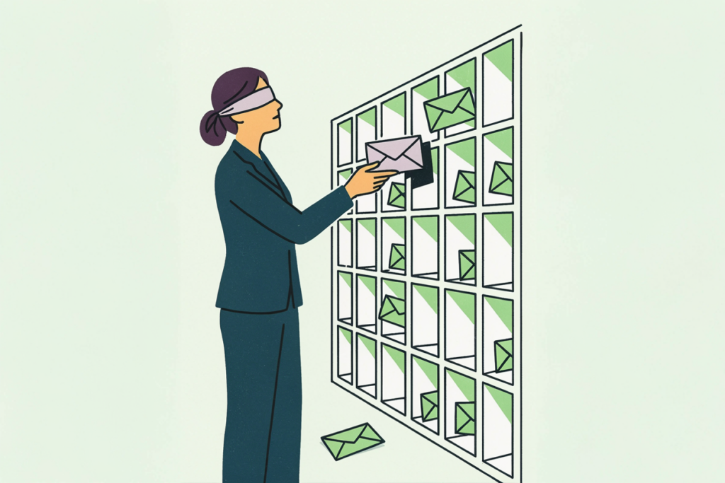
A customer health score is a churn model built by committee. Someone picks five metrics, someone else argues the weights up and down in a meeting, and the resulting number gets a color and a place on the QBR slide. The popular analogy is a credit score for your accounts, and it holds in one sense: both compress many signals into one number. The difference is that a credit score is trained on millions of real repayment outcomes, and yours is trained on a whiteboard.
That’s a fixable problem, and this post fixes it in two halves. First, the best possible version of the scorecard: the metrics that belong in it, the ones that mislead, the formula step by step, and a downloadable template with the weighted model prebuilt. Second, the honest critique from the prediction side: exactly where weighted scorecards fail, why green accounts churn anyway, and what it takes to replace the guessed weights with learned ones.
Definition first. A customer health score is a single number, usually 0 to 100 and displayed as red, yellow, or green, that combines signals such as product usage, support activity, sentiment, and billing into an estimate of how likely an account is to renew, expand, or churn. Customer success teams use it to decide where to spend attention this week.

What is a customer health score?
Strip away the vendor dashboards and a health score is a weighted average. You pick a handful of things you can measure about an account, convert each to a common scale, multiply each by how much you think it matters, and add them up. The output gets bucketed into bands so a CSM can scan a list and see which accounts need a call.
It does three jobs in a customer success org. It ranks the book so attention goes to the accounts that need it. It gives leadership a single trend line for “how is the base doing.” And it triggers playbooks: a drop into yellow fires an outreach, a drop into red fires an escalation.
All three jobs depend on the score being right about risk. The rest of this post is about how to make it as right as a hand-built formula can be, and what to do when that’s no longer enough.
The metrics that belong in a health score (and the ones that lie)
Most vendors agree on four families of customer health score metrics, and the consensus is roughly correct. What the consensus misses is which of them lead and which lag.
Product usage. Logins, active users against licensed seats, sessions per week, time in product. Usage is the most-cited signal, and it’s a lagging one. By the time logins fall, the decision to leave has usually been made. Feature breadth (how many of your core capabilities an account uses) tends to lead: an account that used six features last quarter and three this quarter is telling you something months before its login count does.
Support health. Open tickets, escalations, time to resolve, ticket sentiment. A rising ticket count can mean two opposite things: an engaged customer pushing the product, or a frustrated one documenting a case for leaving. The distinction lives in the ticket text and the resolution times, and a count alone can’t see it.
Sentiment. NPS, CSAT, the tone of the last QBR. Valuable when fresh, and most survey data is stale within weeks. A 9 from eight months ago is a memory.
Billing and commercial signals. On-time payment, contract stage, downgrade requests, seat changes. These are among the most reliable signals you have and often the least used, because they live in finance systems rather than the CS tool.
Relationship. Is the executive sponsor still there? Did the champion change jobs? A champion leaving is one of the strongest churn predictors in B2B, and it shows up in LinkedIn before it shows up anywhere in your product.
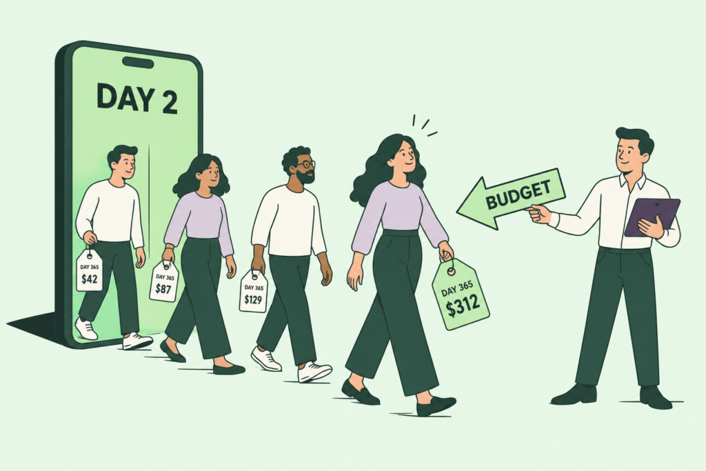
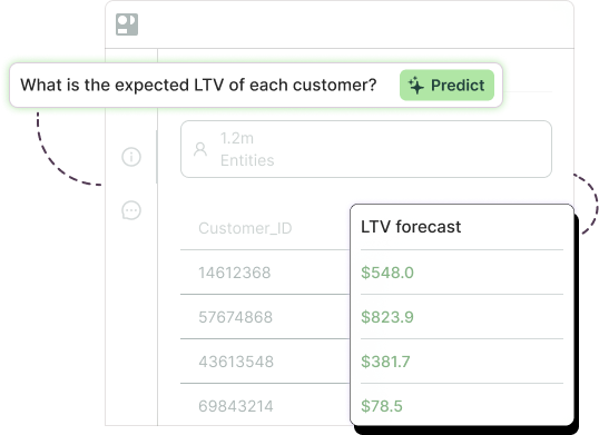
One useful cross-check: an account’s expected future value should inform how much you invest in saving it. Pairing the health score with a customer lifetime value prediction keeps the team from spending a week rescuing a red account worth a tenth of the yellow one next to it.

The customer health score formula, step by step
Written out, the customer health score formula is a weighted sum. Four steps.
Step 1. Pick your metrics. Six is a good number. Fewer than four and the score is fragile. More than eight and nobody can explain a change. The template below uses product usage, feature breadth, support health, sentiment, billing, and relationship.
Step 2. Score each metric from 0 to 100. This is the normalization step, and it’s where most scorecards get sloppy. Write down the rule for each metric so two CSMs score the same account the same way. For example: NPS 9 or 10 scores 100, 7 or 8 scores 60, 0 to 6 scores 20. Billing: paid on time 100, paid late once 50, downgrade request or dispute 0.
Step 3. Assign weights that total 100%. A defensible starting point: product usage 30%, feature breadth 15%, support health 15%, sentiment 15%, billing 15%, relationship 10%. These are a starting opinion, and we’ll come back to why that word matters.
Step 4. Multiply and add. Health score = Σ (metric score × weight).
Here’s a filled-in example. An account that pays on time, has a clean support history, but is using noticeably fewer features than it used to, with a lukewarm last survey and a champion who recently went quiet:
| Metric | Weight | Score(0 to 100) | Weighted points |
| Product usage | 30% | 70 | 21.0 |
| Feature breadth | 15% | 40 | 6.0 |
| Support health | 15% | 80 | 12.0 |
| Sentiment | 15% | 60 | 9.0 |
| Billing | 15% | 100 | 15.0 |
| Relationship | 10% | 50 | 5.0 |
| Health score | 100% | 68 |
With bands of green at 75 and above, yellow from 50 to 74, and red below 50, this account is yellow. Worth noticing what carried it there: the two leading signals (breadth and relationship) are the weakest rows, and the two lagging ones (support and billing) are propping the score up. A month earlier, before breadth slipped, it was green.
Free template: a weighted scorecard you can copy
Six metrics, weights that have to total 100%, and red, yellow, and green bands you can move. Score one account here, then score your whole book below. Nothing leaves your browser.
Score one account
Set a weight and a 0 to 100 score for each metric. The scoring rule under each name keeps two CSMs consistent.
Health score
68out of 100
Score your whole book
Same weights and thresholds as above. Type over the example accounts, add rows, and export a CSV when you’re done.
| Account | Product usage | Feature breadth | Support health | Sentiment | Billing | Relationship | Score | Band |
|---|
Replace the guessed weights with learned ones. See a churn model on your accounts.
Our customer health score template is an Excel workbook with the weighted model prebuilt. It has three sheets. The first is a single-account scorecard with the six metrics, editable weights that warn you when they don’t total 100%, and editable band thresholds. The second is a batch sheet that scores your whole book at once and assigns the bands automatically. The third holds the scoring rules and the limits of the approach.
Change the yellow cells only. The example account above is preloaded so you can see the format, and the batch sheet ships with five sample accounts to overwrite.

Where health scores fail
Now the half most vendor pages leave out, because it undercuts the product they’re selling.
The weights are opinions. Nobody has checked whether feature breadth deserves 15% of the score or 40%. The weights came from a meeting, they encode whoever argued hardest, and they’ve never been tested against which accounts actually churned. Two companies with identical scorecards can have completely different real drivers of churn.
The thresholds are static. Green at 75 is a line someone drew. An account can sit at 76 for six months while its underlying risk climbs, because the score only moves when an input moves, and the inputs that move first often carry the smallest weights.
The signals lag. Logins drop after the decision. Surveys are stale. Tickets close. By the time enough lagging signals have fallen to drag a score into red, the renewal conversation is a formality.
Green accounts churn anyway. Put those three together and you get the failure every CS leader has lived through. Here’s a composite of a pattern we see repeatedly. A mid-market account, green for four straight quarters, sponsor happy in every QBR, tickets resolved fast, paid on time every month. Ninety days before renewal the champion took a job elsewhere, which the scorecard didn’t track. The new owner ran a vendor review, which no metric captured. Usage stayed flat, because the team kept using the product right up until the contract lapsed. The score was green the week the cancellation notice arrived. The gap is measurable. Across the churn deployments we reviewed, predictive models identified future churners 3x more precisely than the rule-based methods the same teams used before, with a range of 1.4x to 20x, and every model in the set flagged cancellation at least 30 days out, several at 60 to 90.
Scorecards still have a place. For a book of 40 accounts, a scorecard is a decent first approximation of what a churn model measures directly, and it may be all you need. What a scorecard cannot do is learn. When it’s wrong, the only feedback loop is a meeting to argue about the weights again.

The predictive upgrade: from scorecard to churn model
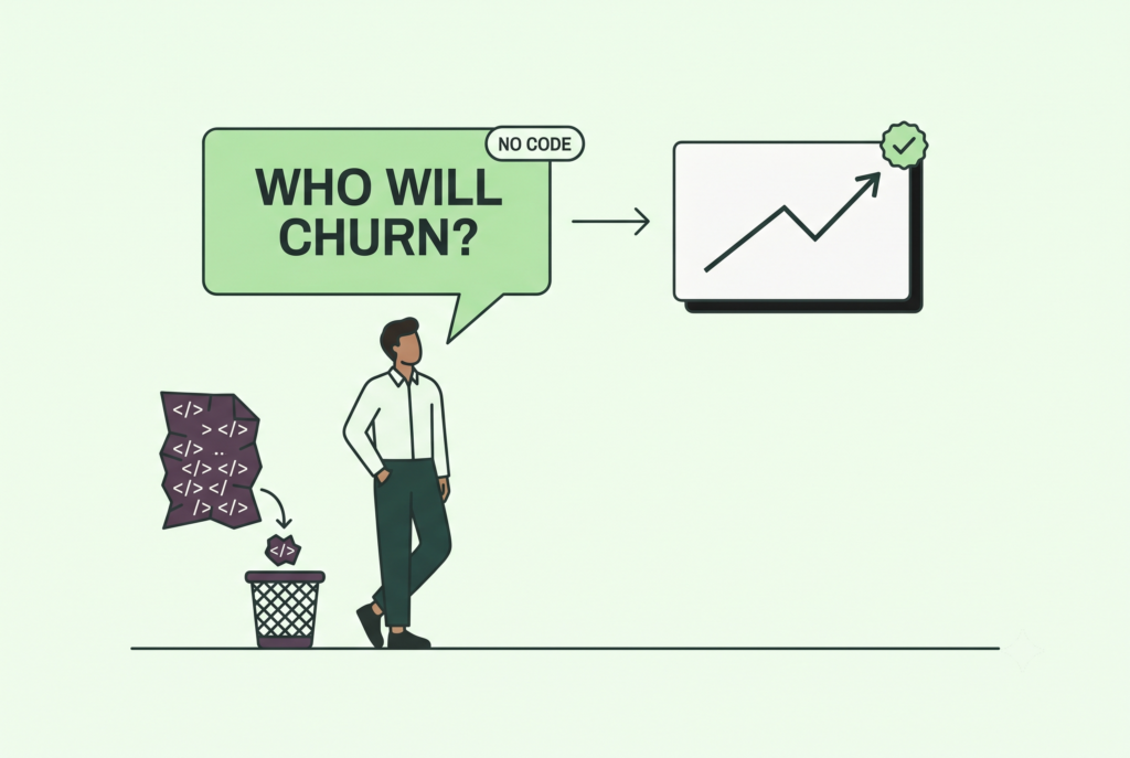
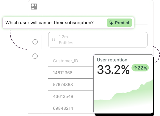
Mechanically, a churn model does the same thing a scorecard does, with one change: it learns the weights from your outcomes instead of your opinions.
Feed it the history of every account, including the ones that churned and the ones that stayed, along with everything you knew about each account in the months beforehand, and it works out which signals actually preceded churn at your company, how much each one mattered, and how they interact. Feature breadth might turn out to matter three times as much as logins. A support ticket in the first 30 days might turn out to be a good sign. Your scorecard could never have told you either, because nobody thought to weight it that way.
Three practical differences follow. The model scores every account daily rather than at QBR time, so the trend is visible while there’s still a quarter left to act on it. It explains each score, so a CSM sees “risk rose because seat count dropped 20% and the sponsor hasn’t logged in for 45 days” rather than a number. And it improves as outcomes come in, which is the feedback loop the scorecard was missing. Our guide to churn prediction models covers what’s under the hood if you want it.
Usually the objection at this point is “we don’t have data scientists.” Two customers show what that looks like in practice.
Clearwave Fiber, a fiber internet provider with a lean analytics team and no data science hires, built a churn model with Pecan in about four weeks and had it live in two months. Ranking subscribers by predicted risk and targeting the top of the list, treated customers in the highest-risk segment churned at 1.2 to 1.5% against roughly 40% for a control group. “The software does the math for us,” their reporting and analytics director told us. “All we must do is interpret the results.”
Over at The Credit Pros, a credit repair fintech, the team had been taking about three months to build a churn model by hand. With Pecan the same model took two to three weeks, and the churn probabilities now write straight into Salesforce, where the business team designs the treatment for each at-risk client. They report longer client retention and higher revenue as the result.
Notice that last detail, because it matters for the scorecard question. The output of a churn model looks exactly like a health score: a number per account, in the tool the CS team already works in. The difference is on the inside.

Pecan’s Predictive AI Agent is how teams like these get there without hiring. You ask “which accounts are likely to churn in the next 90 days,” point it at the customer, usage, support, and billing history you already have, and it prepares the data, builds and validates the model, checks it for leakage and imbalance, and writes the scores and explanations into Salesforce, HubSpot, or your warehouse. It’s designed for the messy, multi-system data a real CS org actually has.
If your scorecard has ever been green on an account that left, book a demo. Bring the scorecard, and we’ll train a churn model on the same accounts so you can compare the two lists.
Health score examples: what red, yellow, and green should trigger
Each band has to map to an action, or the score is decoration. What the bands should trigger:
Green (75 and above). Expansion motion. These are the accounts to ask for references, case studies, and upsell conversations, and the place to look for expansion opportunities. Watch the trend rather than the level: a green account that dropped eight points this month is a yellow account with a head start. One low-cost check is a quarterly customer segmentation pass to see whether your green accounts share traits your yellow ones lack.
Yellow (50 to 74). Diagnose, then intervene. Pull the score apart to see which metric moved and act on that specific signal: a breadth drop gets an enablement session on the unused features, a champion change gets an executive intro within two weeks, a stale survey gets a fresh one. Yellow is the band where a well-designed playbook pays for the whole scorecard, because there’s still time.
Red (below 50). Escalate and decide. Executive sponsor call inside a week, a written save plan, and an honest assessment of whether the account is worth saving relative to its value. Some red accounts should be allowed to go. For the ones that have already lapsed, the playbook shifts to how you win back customers, which is a different motion with different offers.
Whatever the band, log what you did and what happened. That log is the training data for the model that eventually replaces the scorecard, and most teams throw it away.
How do you calculate a customer health score?
What metrics go into a customer health score?
What is a good customer health score?
What is the difference between a health score and a churn prediction?

Asaf is the Head of Customer Success at Pecan AI, where he helps enterprise customers turn predictive analytics into real, measurable business outcomes. He’s grown through Pecan from AI Success Manager to Team Lead to Director, bringing a strategic consulting background and an Economics degree from the Hebrew University of Jerusalem (plus a serious scuba diving habit).